Stop Wasting Time on Bad Designs: Master Text Alignment in Canva!
Hey Genius Junkies! Ever finish a Canva design, take a step back, and think, "Ugh, something's off"? More often than not, the culprit isn't your color palette or font choice – it's your text alignment! Bad alignment can make even the most beautiful graphics look messy, unprofessional, and frankly, a bit lazy.
But don't worry! In this guide, we're diving deep into the often-overlooked art of text alignment in Canva. You’ll learn how to wield Canva's tools like a pro, ensuring your text is always polished, visually appealing, and perfectly balanced. Get ready to elevate your designs and save yourself a ton of frustration!
Why Text Alignment is Your Design Superpower
Think of text alignment as the invisible glue that holds your design together. When text is aligned correctly, it creates a sense of order, improves readability, and guides the viewer's eye seamlessly through your content. On the flip side, poor alignment can lead to visual chaos, making your message hard to digest and your design look amateurish. Mastering this fundamental skill is key to creating designs that truly stand out, whether for social media, presentations, or print.
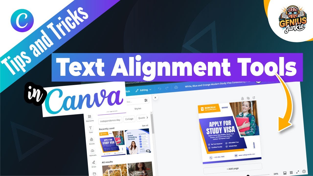
Essential Canva Tools for Laser-Sharp Alignment
Canva is packed with features designed to make your alignment journey a breeze. Let's explore the must-know tools:
- The Alignment Toolbar: Your first stop for any alignment task! Select your text box, and you'll see options for left, center, right, and justified alignment.
- Position Tool: This is where the magic happens for precise placement. Select one or more elements, click "Position," and you can align them to the top, middle, bottom, left, right, or center of your page (or relative to each other if multiple elements are selected). The "Tidy Up" feature is a game-changer for distributing elements evenly!
- Grouping Elements: Want to move a block of text and an icon together while maintaining their internal alignment? Select them both, then click "Group." Now they act as one unit, making it easy to align them on your page without messing up their relationship.
- Rulers & Guides: Turn these on (File > View settings > Show rulers and guides) for visual assistance. Drag from the rulers to create temporary guides that help you line up elements perfectly across your design.
Pro Tips for Balancing & Spacing Text Effectively
Beyond the basic tools, here are some insider tips to truly master text alignment and spacing:
- Choose Your Alignment Wisely:
- Left-aligned: Most common and easiest to read, especially for long blocks of text, as it creates a consistent left edge for the eye to follow.
- Center-aligned: Best for short headlines, quotes, or invitations where a symmetrical, formal look is desired. Avoid for paragraphs!
- Right-aligned: Use sparingly, often for small chunks of text that need to draw attention to the right side of a design, like a date or signature.
- Justified: Creates clean left and right edges. Use with caution! It can sometimes create awkward gaps between words (rivers) if not handled with care. Adjusting letter and line spacing can help.
- Master Line Spacing (Line Height): Often overlooked, this controls the vertical space between lines of text. Too tight, and your text is cramped; too loose, and it looks disconnected. Find the sweet spot for readability – usually slightly more than the default. You'll find this in the "Spacing" option in your text toolbar.
- Adjust Letter Spacing (Kerning): This controls the horizontal space between individual letters. Canva's default is usually good, but for large headings or specific fonts, you might want to tighten or loosen it slightly for visual harmony. Again, find this under "Spacing."
- Think Visual Balance, Not Just Grids: While grids and strict alignment are fantastic, sometimes a design needs a touch of visual balance rather than absolute mathematical precision. Train your eye! Step back and look at your design as a whole. Does it *feel* right? Sometimes, a tiny nudge, even if it breaks a perfect grid line, can make the design stronger.
Key Takeaways
- Text alignment is crucial for professional, readable designs.
- Utilize Canva's Alignment Toolbar, Position Tool, Grouping, and Rulers/Guides.
- Select the appropriate alignment (left, center, right, justified) for your content.
- Optimize line and letter spacing for improved readability and visual appeal.
- Develop your eye for visual balance; sometimes, it trumps strict grid adherence.
There you have it, Genius Junkies! No more wasted time on designs that just don't hit the mark. By applying these simple yet powerful text alignment and spacing techniques in Canva, you'll be creating polished, professional graphics that grab attention and convey your message with clarity. Now go forth and align with confidence!