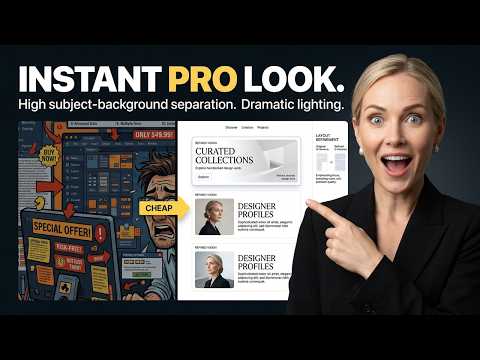
Stop picking colors just because you like them, and stop centering every single element on the page. If your designs look like a muddy, cluttered flyer from 2012, it's not because you lack talent—it's because you lack restraint. 👇
In this Masterclass, I'm breaking down exactly why your graphics look cheap, and how to instantly elevate them using professional agency frameworks. We’re covering the C.R.A.P. principle, the 60-30-10 color rule, the 2-Font Maximum, and the actual luxury of White Space.
🎁 FREE DOWNLOAD: THE 30-SECOND DESIGN AUDIT CHECKLIST
Run your designs through this exact framework before you hit publish to ensure they look premium and convert. Grab it right here (no email required): 🔗 [Insert Link Here]
In This Video:
0:00 - The Problem with "Cheap" Design
1:04 - The C.R.A.P. Principle (Proximity & Alignment)
2:15 - The 2-Font Maximum Rule
3:30 - The "Squint Test" for Visual Hierarchy
4:12 - Why Deleting Noise = More Sales
5:05 - The 60-30-10 Color Rule
5:40 - The Luxury of White Space
Optimized YouTube Tags Canva tutorial 2026, fixing cheap design, bad graphic design tips, Canva hacks, graphic design for beginners, how to use Canva like a pro, the CRAP design principle, Canva color rules, Canva typography tips, stop designing manually, graphic design passive income, make Canva look professional, clean aesthetic tutorial, freelancer workflow, the creator design OS
🎯 Who this is for:
Entrepreneurs, side-hustlers, freelancers, and anyone who wants to make money online using smart systems.
🛠 Tools Mentioned:
• Canva – https://www.canva.com/
• (Add affiliate links here)
📦 Resources:
• Free Templates: [Your link]