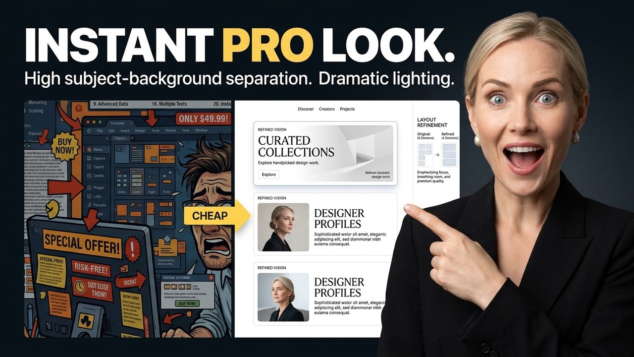
Stop Your Designs From Looking Cheap: The 30-Second Pro Audit
Ever look at your Canva creations or Etsy listings and think, "Something's just... off?" You spend hours picking colors, finding fonts, and arranging elements, but the end result still feels like a muddy, cluttered flyer from 2012. You're not alone, and it's not because you lack talent. More often than not, it's because you lack one crucial thing: restraint.
At Genius Junkie, we're all about empowering you to create stunning designs that truly stand out. That's why we're breaking down the exact agency frameworks professionals use to instantly elevate their graphics. Get ready for our 30-Second Pro Audit – your fast track to designs that look polished, professional, and anything but cheap.
The C.R.A.P. Principle: Your Design Foundation
Forget everything you thought about design "rules" and embrace C.R.A.P. – a powerful acronym that stands for Contrast, Repetition, Alignment, and Proximity. Mastering these four principles will transform your designs from chaotic to cohesive:
- Contrast: Don't be afraid to make elements dramatically different. Think dark text on a light background, or a large headline next to small body text. Contrast creates visual interest and hierarchy, making your design pop.
- Repetition: Consistency is key! Repeat visual elements throughout your design, like specific colors, fonts, shapes, or spacing. This builds familiarity, strengthens your brand identity, and ties everything together.
- Alignment: Stop centering everything! Aligning elements to a common edge (left, right, or even top/bottom) creates a clean, organized look that's easy on the eyes and instantly more professional.
- Proximity: Group related items together. If elements are close, your viewer will perceive them as belonging together, reducing clutter, improving readability, and creating clear sections.
The 60-30-10 Color Rule: Master Your Palette
Picking colors "just because you like them" is a recipe for visual chaos. Professional designers use the 60-30-10 rule to create harmonious palettes that are balanced and appealing. Here's how it works:
- 60% Dominant Color: This is your main color, used for large areas like backgrounds or primary elements.
- 30% Secondary Color: A complementary color that supports your dominant hue, used for accents, subheadings, or secondary elements.
- 10% Accent Color: Your pop of color! Use this sparingly for calls to action, important icons, or to draw attention to specific details.
This rule ensures balance and prevents your design from becoming a muddy mess of competing hues, instantly elevating its perceived value.
The 2-Font Maximum: Less is More for Typography
The urge to use every cool font you find can be strong, but resist it! Professional designs rarely use more than two fonts, sometimes three if absolutely necessary. One font for your headings and another for your body text is often all you need. This creates a clean, consistent, and sophisticated look. Too many fonts instantly screams "amateur" and makes your design harder to read.
The Actual Luxury of White Space
This is where many DIY designers go wrong. They feel every inch of the canvas needs to be filled. But white space (or negative space, as it's also known) isn't empty; it's a powerful design element. Think of high-end brands – their designs often feature ample white space, giving elements room to breathe. It improves readability, creates a sense of luxury, and guides the viewer's eye to what truly matters. Stop cramming and start breathing!
Key Takeaways for Instant Design Elevation
- Embrace Restraint: Less is often more. Don't feel the need to fill every corner of your design.
- Apply C.R.A.P.: Utilize Contrast, Repetition, Alignment, and Proximity to organize and enhance your layouts.
- Master Your Colors: Stick to the 60-30-10 rule for balanced and professional palettes.
- Limit Your Fonts: Two fonts are typically all you need for a clean, cohesive, and readable look.
- Utilize White Space: Give your elements room to breathe to create a premium, legible design and draw focus.
Ready to transform your designs from cheap to chic? Start applying these principles today and watch your Canva and Etsy creations truly shine!